Plotting and Visualization with plotnine#
Every ModernDiD estimator produces a result object that can be passed directly to a built-in plot function. The visualization layer is built on plotnine, a Python implementation of R’s ggplot2. If you have used ggplot2 in R, the syntax will feel familiar. If you are new to the grammar of graphics, the essential idea is that plots are built by composing layers (data mappings, aesthetics, geometric shapes, scales, and themes) into a single object.
All plot functions return a plotnine ggplot object. This means you get a
useful default plot immediately, but you can also add layers, swap themes,
and modify any visual element using the full plotnine API.
Built-in plot functions#
ModernDiD ships six plot functions. Pass a result object, get back a
ggplot you can customize with the + operator.
Function |
Description |
Accepts results from |
|---|---|---|
Treatment effects relative to adoption period |
|
|
Faceted group-time estimates with one panel per cohort |
||
Aggregated effects by group or calendar time |
|
|
Dose-response curve (ATT or ACRT vs. treatment intensity) |
||
Placebo and effect horizons for intertemporal effects |
||
Confidence intervals across a sensitivity parameter grid |
Every estimator tutorial includes plotting code with rendered output. See the tutorial list at the bottom of this page for direct links.
Common parameters#
All plot functions share a set of parameters that control the most frequently adjusted visual elements.
show_ciToggle confidence intervals on or off. Set
show_ci=Falseto display only point estimates without error bars or ribbons. This can be useful when overlaying estimates from multiple specifications.ref_lineY-value for the horizontal reference line. The default is 0, which places a dashed line at zero to help readers assess whether effects are statistically or economically meaningful. Set
ref_line=Noneto remove it entirely.ref_periodAvailable only in
plot_event_study. Adds a vertical dotted line at the specified event time, typically set to-1to mark the last pre-treatment period. When specified, the connecting line between estimates is suppressed so each point stands on its own.xlab,ylab,titleCustom axis labels and plot title. Each function supplies sensible defaults (
"Event Time"for event studies,"Treatment Cohort"for group aggregations), but custom labels are common in applied work.
did.plot_event_study(
    event_study,
    ref_period=-1,
    xlab="Years Relative to Minimum Wage Increase",
    ylab="ATT (Log Teen Employment)",
    title="Dynamic Treatment Effects",
)
Themes#
All plot functions default to plotnine’s theme_gray, the classic
ggplot2 look with a light gray background and white gridlines. You can swap
it for any plotnine theme
or one of the three built-in ModernDiD themes
by adding it to the plot object with the + operator.
theme_moderndidWhite background, visible axis lines, no grid. Suitable for exploratory work and presentations.
theme_publicationSmaller font sizes, panel border instead of axis lines, legend at the bottom, and a default figure size of 6 by 4 inches at 300 DPI.
theme_minimalReduced visual elements with lighter axis lines and no legend or strip background fills. Suitable for dashboards and slide decks.
from plotnine import labs, theme, theme_gray

p = did.plot_event_study(event_study, ref_period=-1)
p = (p
    + labs(
        x="Years Relative to Treatment",
        y="ATT (Log Employment)",
        title="Minimum Wage Effects on Teen Employment",
    )
    + theme_minimal()
    + theme(legend_position="bottom")
)
Since themes are composable, you can start from any theme and override
individual elements. For example, to use theme_gray but place the
legend on the right instead of the bottom.
from plotnine import theme

p + theme_gray() + theme(legend_position="right")
Color palette#
The built-in color assignments are stored in the COLORS dictionary.
from moderndid.plots import COLORS
print(COLORS)
{
    "pre_treatment": "#1a3a5c",
    "post_treatment": "#c0392b",
    "line": "#3a3a3a",
    "ci_fill": "#bfbfbf",
    "reference": "gray",
    "original": "#d4a017",
    "flci": "#1a3a5c",
    "conditional": "#2ecc71",
    "c_f": "#9b59b6",
    "c_lf": "#c0392b",
}
Pre-treatment estimates use a dark navy (#1a3a5c) and post-treatment
estimates use red (#c0392b). Dose-response curves use a dark slate
line (#2c3e50) with a gray ribbon (#95a5a6).
To override colors on a specific plot, use plotnine’s scale_color_manual.
Here we restyle plot_event_study with an orange-and-black palette.
from plotnine import labs, scale_color_manual, theme, theme_gray

p = did.plot_event_study(event_study, ref_period=-1)
p = (p
    + scale_color_manual(
        values={"Pre": "#e67e22", "Post": "#252525"},
        limits=["Pre", "Post"],
        name="Treatment Status",
    )
    + labs(
        x="Years Relative to Treatment",
        y="ATT (Log Employment)",
        title="Minimum Wage Effects on Teen Employment",
        subtitle="Dynamic treatment effects from Callaway and Sant'Anna (2021)",
    )
    + theme_gray()
    + theme(legend_position="bottom")
)
This is useful when you want to match an existing color scheme or distinguish estimator phases more clearly.
Saving plots#
The save method on any ggplot object writes the figure to disk.
The format is inferred from the file extension. Here we use
plot_event_study as an example.
p = did.plot_event_study(event_study, ref_period=-1)

# PNG for slides or web
p.save("figure1.png", dpi=200, width=8, height=5)

# PDF for LaTeX documents
p.save("figure1.pdf", width=8, height=5)

# SVG for scalable web graphics
p.save("figure1.svg", width=8, height=5)
The width and height parameters are in inches. You can combine a
theme with specific export settings to match whatever format you need.
from plotnine import theme_gray

p = did.plot_event_study(event_study, ref_period=-1) + theme_gray()
p.save("figure1.pdf", width=6, height=4, dpi=300)
Building custom plots#
Every plot function converts its result object into a polars DataFrame internally. You can call these converters directly to extract the underlying data, then build any visualization you want with plotnine or another plotting library.
Extracting plot data#
The to_df function converts any result object to a polars
DataFrame. It auto-detects the result type, so there is one function to
remember regardless of which estimator produced the result.
import moderndid as did

df = did.to_df(event_study)
print(df)
shape: (7, 6)
┌────────────┬───────────┬──────────┬───────────┬───────────┬──────────────────┐
│ event_time ┆ att       ┆ se       ┆ ci_lower  ┆ ci_upper  ┆ treatment_status │
│ ---        ┆ ---       ┆ ---      ┆ ---       ┆ ---       ┆ ---              │
│ f64        ┆ f64       ┆ f64      ┆ f64       ┆ f64       ┆ str              │
╞════════════╪═══════════╪══════════╪═══════════╪═══════════╪══════════════════╡
│ -3.0       ┆ 0.030507  ┆ 0.015034 ┆ -0.010777 ┆ 0.071791  ┆ Pre              │
│ -2.0       ┆ -0.000563 ┆ 0.013292 ┆ -0.037064 ┆ 0.035937  ┆ Pre              │
│ -1.0       ┆ -0.024459 ┆ 0.014236 ┆ -0.063554 ┆ 0.014636  ┆ Pre              │
│ 0.0        ┆ -0.019932 ┆ 0.011826 ┆ -0.052408 ┆ 0.012545  ┆ Post             │
│ 1.0        ┆ -0.050957 ┆ 0.016893 ┆ -0.097349 ┆ -0.004566 ┆ Post             │
│ 2.0        ┆ -0.137259 ┆ 0.036436 ┆ -0.237315 ┆ -0.037202 ┆ Post             │
│ 3.0        ┆ -0.100811 ┆ 0.034359 ┆ -0.195166 ┆ -0.006457 ┆ Post             │
└────────────┴───────────┴──────────┴───────────┴───────────┴──────────────────┘
The DataFrame contains one row per displayed estimate with columns for the
x-axis value, point estimate, standard error, confidence bounds, and a
treatment status label used for coloring. Reference period rows (where the
standard error is NaN) are automatically filtered out.
For dose-response results, pass effect_type to select ATT or ACRT:
df_att  = did.to_df(dose_result, effect_type="att")
df_acrt = did.to_df(dose_result, effect_type="acrt")
Advanced customization#
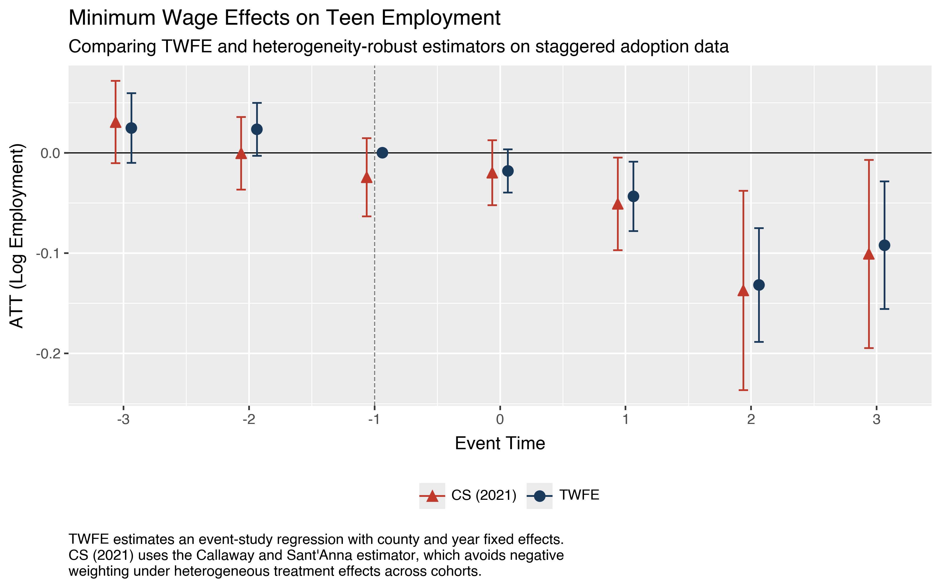
A common task is overlaying estimates from different estimators on the same figure. The code below compares the Callaway and Sant’Anna (2021) estimator against a standard two-way fixed effects (TWFE) event study estimated with pyfixest.
The TWFE specification regresses log teen employment on event-time indicators (with event time -1 as the omitted category), log population, and county and year fixed effects. We cluster standard errors at the county level to match the level of treatment assignment.
import numpy as np
import pyfixest as pf

pdf = data.to_pandas()
pdf["rel_time"] = np.where(
    pdf["first.treat"] > 0,
    pdf["year"] - pdf["first.treat"],
    -99,
)

fit = pf.feols(
    "lemp ~ i(rel_time, ref=-1) + lpop | countyreal + year",
    data=pdf,
    vcov={"CRV1": "countyreal"},
)
To build the comparison figure, we extract the ModernDiD event study
estimates with to_df and the TWFE
coefficients from pyfixest, then combine them into a single DataFrame with
an estimator column.
import polars as pl
import pandas as pd
import moderndid as did

# **ModernDiD** estimates
es_df = did.to_df(event_study)
mdid_pd = es_df.select([
    pl.col("event_time").cast(pl.Int64),
    "att", "ci_lower", "ci_upper",
]).to_pandas()
mdid_pd["estimator"] = "CS (2021)"

# TWFE estimates (event time -1 is the omitted reference, fixed at 0)
coefs = fit.coef()
ci = fit.confint()
mask = coefs.index.str.contains("rel_time")
event_times = sorted(set(pdf["rel_time"]) - {-99, -1})
twfe_pd = pd.DataFrame({
    "event_time": event_times,
    "att": coefs[mask].values,
    "ci_lower": ci.loc[mask, "2.5%"].values,
    "ci_upper": ci.loc[mask, "97.5%"].values,
    "estimator": "TWFE",
})
ref_row = pd.DataFrame({
    "event_time": [-1], "att": [0.0],
    "ci_lower": [np.nan], "ci_upper": [np.nan],
    "estimator": ["TWFE"],
})
twfe_pd = pd.concat([twfe_pd, ref_row], ignore_index=True)

# Combine and filter to common event times
plot_df = pd.concat([
    mdid_pd[mdid_pd["event_time"].between(-3, 3)],
    twfe_pd[twfe_pd["event_time"].between(-3, 3)],
], ignore_index=True)
With both sets of estimates in a single DataFrame, building a publication-quality comparison figure is straightforward.
position_dodge offsets the two estimators horizontally so their
confidence intervals do not overlap. scale_color_manual and
scale_shape_manual assign distinct colors and marker shapes to each
estimator. theme_gray applies the classic R ggplot2 look with a gray
background and white gridlines. The labs function adds a subtitle for
methodological context and a multiline caption with estimation details.
from plotnine import (
    aes, element_text, geom_errorbar, geom_hline, geom_point,
    geom_vline, ggplot, labs, position_dodge, scale_color_manual,
    scale_shape_manual, scale_x_continuous, theme, theme_gray,
)

caption = """\
TWFE estimates an event-study regression with county and year fixed effects.
CS (2021) uses the Callaway and Sant'Anna estimator, which avoids negative
weighting under heterogeneous treatment effects across cohorts.\
"""

dodge = position_dodge(width=0.25)

p = (
    ggplot(plot_df, aes(
        x="event_time", y="att",
        color="estimator", shape="estimator",
    ))
    + geom_hline(yintercept=0, color="black", size=0.4)
    + geom_vline(
        xintercept=-1, linetype="dashed",
        color="gray", size=0.4,
    )
    + geom_errorbar(
        aes(ymin="ci_lower", ymax="ci_upper"),
        width=0.15, size=0.6, position=dodge, na_rm=True,
    )
    + geom_point(size=3, position=dodge)
    + scale_color_manual(
        values={"TWFE": "#1a3a5c", "CS (2021)": "#c0392b"},
    )
    + scale_shape_manual(
        values={"TWFE": "o", "CS (2021)": "^"},
    )
    + scale_x_continuous(breaks=list(range(-3, 4)))
    + labs(
        x="Event Time",
        y="ATT (Log Employment)",
        title="Minimum Wage Effects on Teen Employment",
        subtitle="Comparing TWFE and heterogeneity-robust estimators"
                 " on staggered adoption data",
        caption=caption,
        color="", shape="",
    )
    + theme_gray()
    + theme(
        legend_position="bottom",
        plot_caption=element_text(
            ha="left",
            margin={"t": 1, "units": "lines"},
            linespacing=1.25,
        ),
    )
)
p.save("plot_twfe_comparison.png", dpi=200, width=8, height=5)
Tutorials with plotting#
Each estimator tutorial includes detailed plotting code with rendered output. These are the best place to see the built-in plot functions in action on real data.
Staggered DiD —
plot_gt,plot_event_study,plot_aggTriple DiD —
plot_gt,plot_event_study, custom comparison figuresContinuous Treatment —
plot_dose_response,plot_event_studyIntertemporal Treatment —
plot_multiplegtSensitivity Analysis —
plot_event_study,plot_sensitivity
For the full plotnine API, including geoms, scales, facets, and coordinate systems, see the plotnine documentation.